Project Scope
The Content Studio is a newly formed team at Nestlé Health Science with three designers specializing in different media. As a team, we create content and digital products across 1–16 brands, including social media, paid media, and websites.
When I started designing landing pages and content at Nestlé Health Science, the studio didn't have a design system, and none of the sites followed UI best practices. While working on multiple projects, it was also time-consuming to address UI issues among brand teams, freelancers, and developers.
A UI system could help NHSc to:
✔️ Streamline UI best practices across 16 sites + landing pages
✔️ Reduce time during content handoff between the in-house studio and external agencies
✔️ Free time to focus on what's essential for brand sites: content!
I began this project by adapting an existing system to meet NHSC's requirements. Currently, the library consists of 50+ blocks and is a living product. New blocks are added or revised on a need basis.
As a result, we had more time to focus on digital strategies, content creation, content audits, and photoshoots instead of UI best practices.
The blocks are built with BOOTSTRAP, and 100% of all handoffs are done via GitHub. Once the content is created, I would plug it into the coded layouts and share links with stakeholders to start the content review stage. Once they are approved, these links are shared with third-party agencies that handle implementation.
Comprehensive UAT is performed on sites going through UI overhaul with a group of 5-10 users. Landing page templates are usually recycled, and QA is performed before launches.
➡️ Grid: CSS / BOOTSTRAP
➡️ Software: Figma, HTML, CSS, JS, BOOTSTRAP
➡️ Platform: Drupal
⏲️ Timeline: 6 weeks | 🎩 Role: Research, Design, Pre-Production
Credit: Nestlé Health Science | nestlehelathscience.com
Digging deeper 👇
"How might we help increase productivity and visual consistency between in-house and freelancers across multiple brands?"
With a UI BOOTSTRAP library, we can:
✔️ Streamline UI best practices across multiple sites and landing pages
✔️ Reduce stress during content handoff between the in-house studio and external agencies
✔️ Mix and match pre-defined modular blocks to create custom pages with low-code requirements
Finding the proper focus with target audiences
Knowing the target audience helped narrow down which segment to focus on:
✔️ New users who are new to Nestlé Health Science products or programs
✔️ Users who want to find out more about a specific product or program
✔️ Users who are already a part of the community
After defining the target audience visiting these pages, I researched landing pages and layouts in similar industries to understand how other retailers structured their pages.
Information Architecture (IA)
I can start creating an efficient information architecture by leveraging previous research. The goal is to make the IA as intuitive and straightforward as possible to increase engagement, so the following four components are must-haves on any landing page:
✔️ Compelling headlines: Five seconds is your customers' average time on your website before clicking off. Compelling headlines will encourage users to scroll on and consider the offers instead of bouncing off immediately.
✔️ Clarity over cuteness: Convince your prospects to be covert with persuasive & straight-to-the-point copy.
✔️ Engaging media: copy-heavy content rarely keeps users engaged. Structured pages with a healthy 70/30 text-to-image ratio combined with videos can help users retain the information they read better.
✔️ Strong call to action buttons: Buttons should look like those people have seen before. Tap-friendly touch-points that pop, giving a higher visual hierarchy.
These are the questions the landing pages should help answer:
What can users do on the page?
When and how is it going to be useful for users?
Why should users trust the brand?
Whether they can try it for free, and if not, what is the price?
Answering these questions upfront will help clear up any potential doubts users might have regarding the product, which creates another layer of credibility and trust in the brand. This also helps generate an excitement factor that can lead to conversion.
The following IA was developed, leveraging the learning from my secondary research:
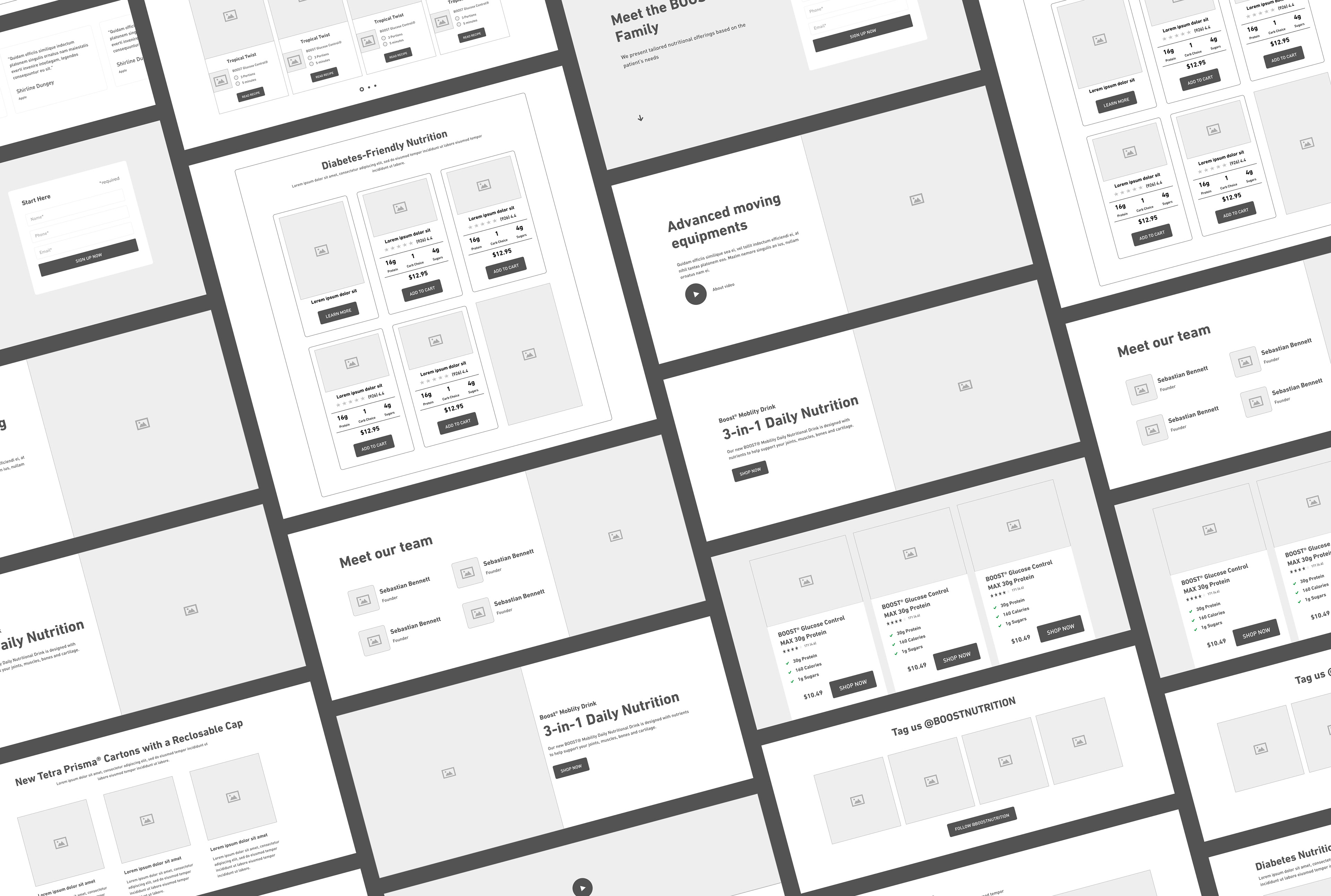
Wireframes
With the layout mapping finished, I sketched out wireframes with paper and pencil to get a rough idea of how each block would look and test how they fit together as a page.
Due to time constraints, I built them using stock templates as a starting point. I modified them to fit the requirements outlined in the previous step. Previous research and findings were referenced multiple times throughout the ideation phase.
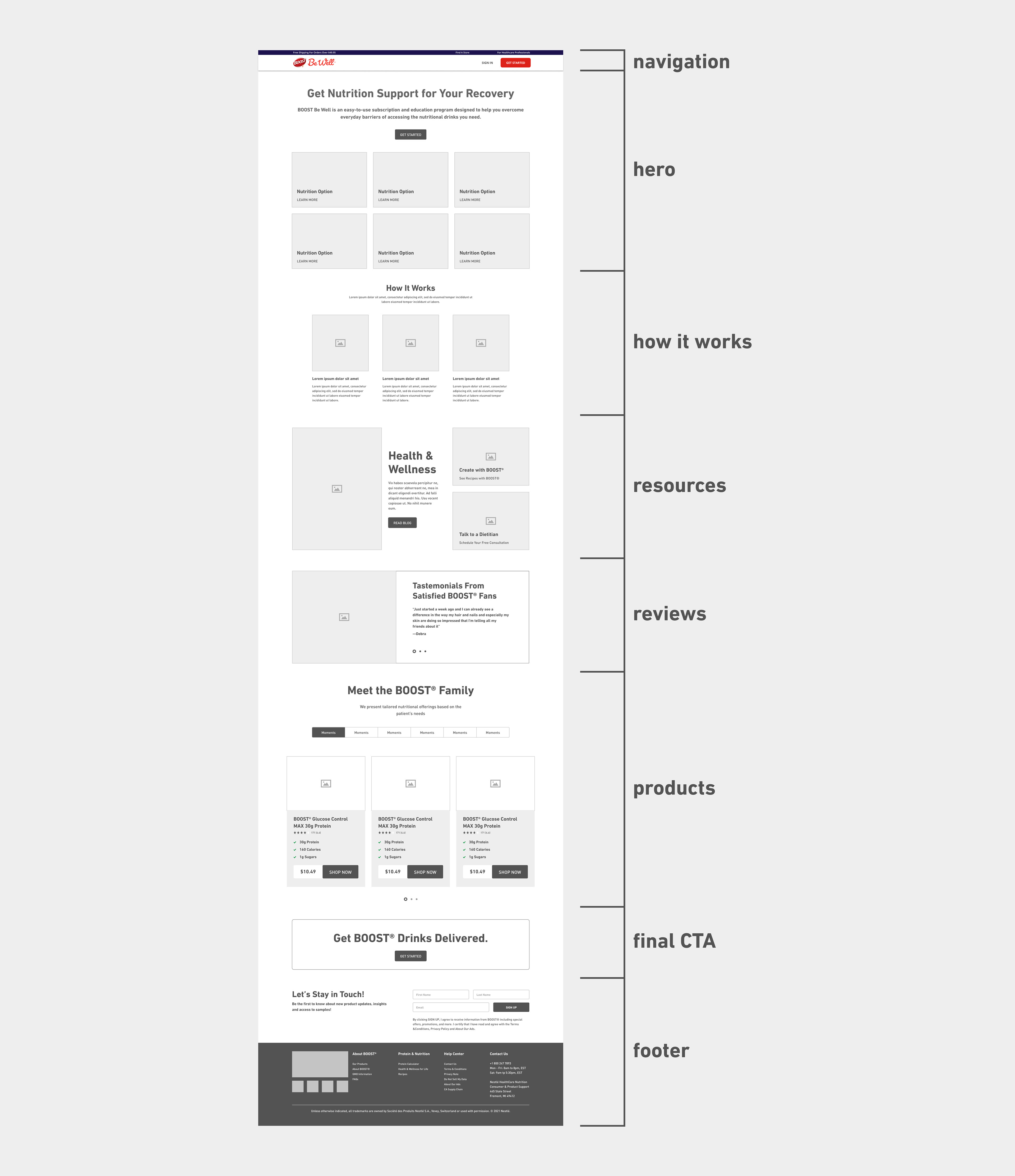
The following is a suggested page layout for BOOST® Be Well™ created the blocks:
Content Framework
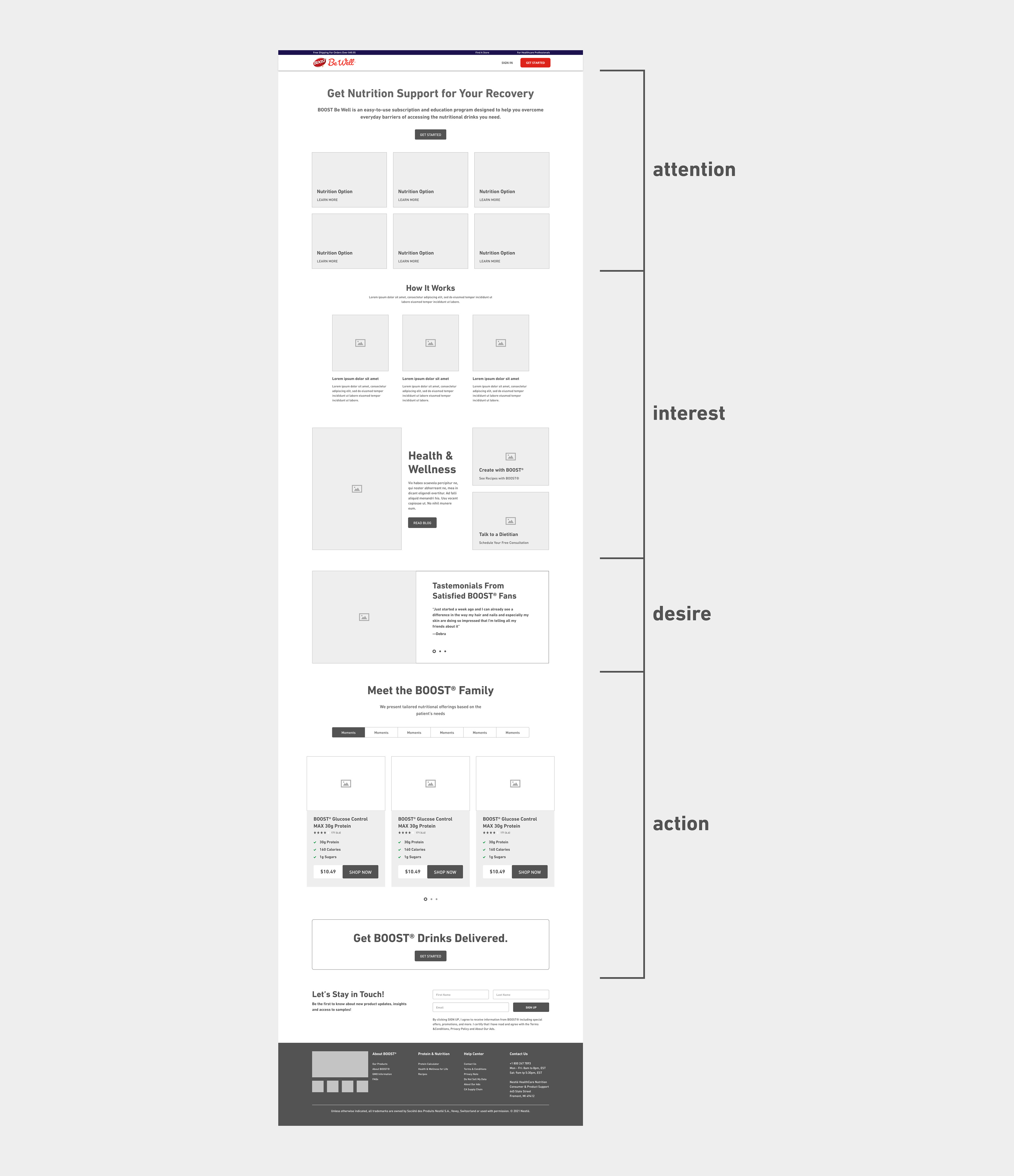
The AIDA (stands for Attention, Interest, Desire, and Action) framework was applied to help maximize the page IA by focusing on the following:
✔️ Attention (cognitive): Obtain the attention of potential users.
✔️ Interest (affective): Appeal to the audience's self-interest with storytelling.
✔️ Desire (affective): Convince users they need the product and how it will help solve a specific problem they have.
✔️ Action (behavior): Lead users towards a measurable action.
Below is a revised layout for BOOST® Be Well utilizing the AIDA framework:
I could also create several landing pages and complete brand sites by leveraging these blocks. Below are different iterations of the page above, created during workshops.
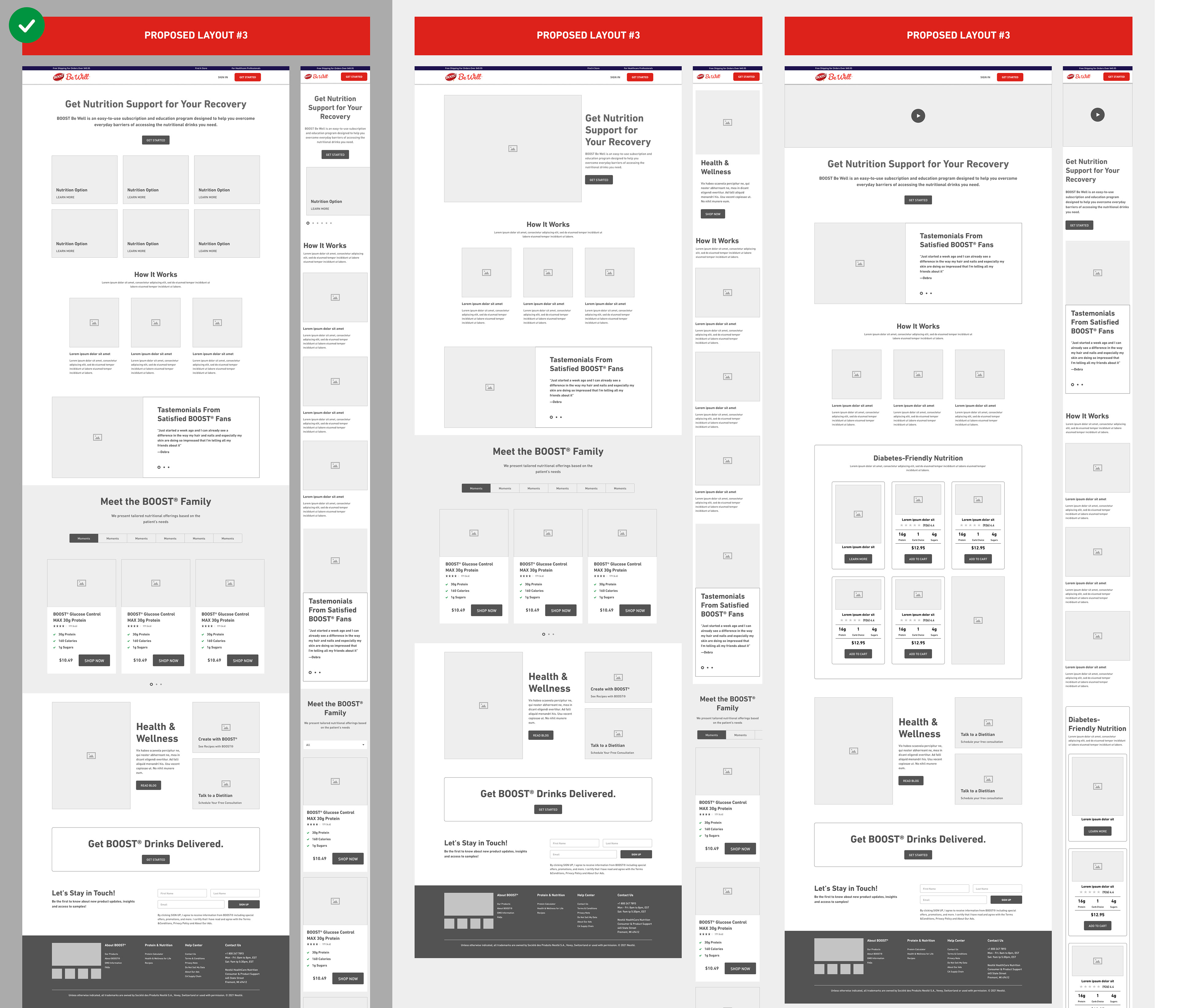
Below are examples of landing pages created with the templates above.
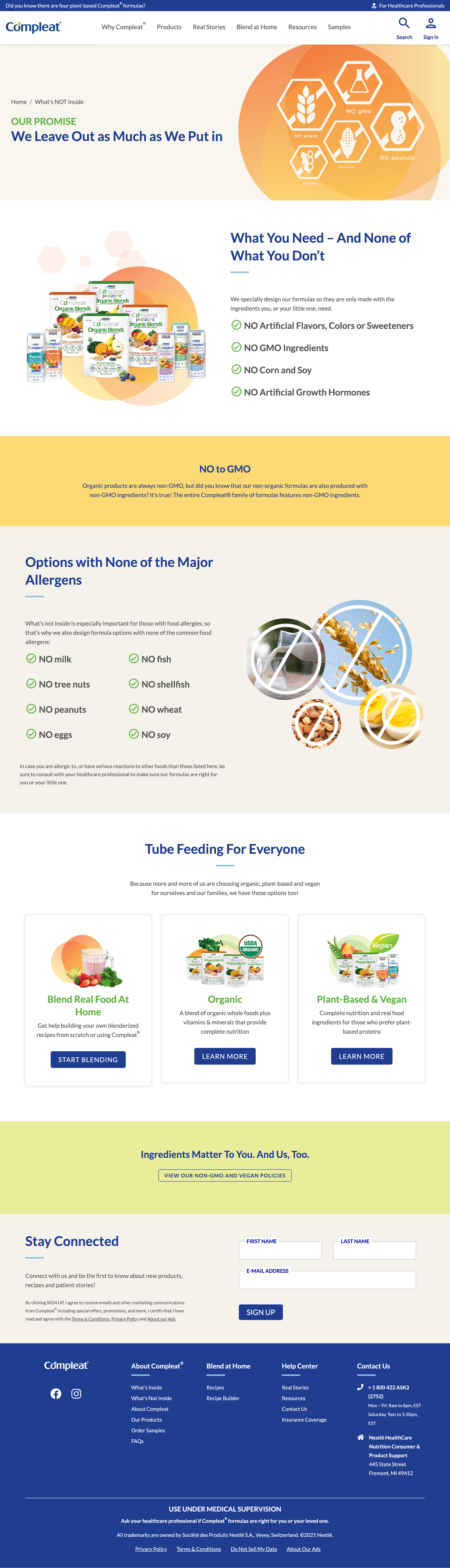
Compleat Ingredients Page
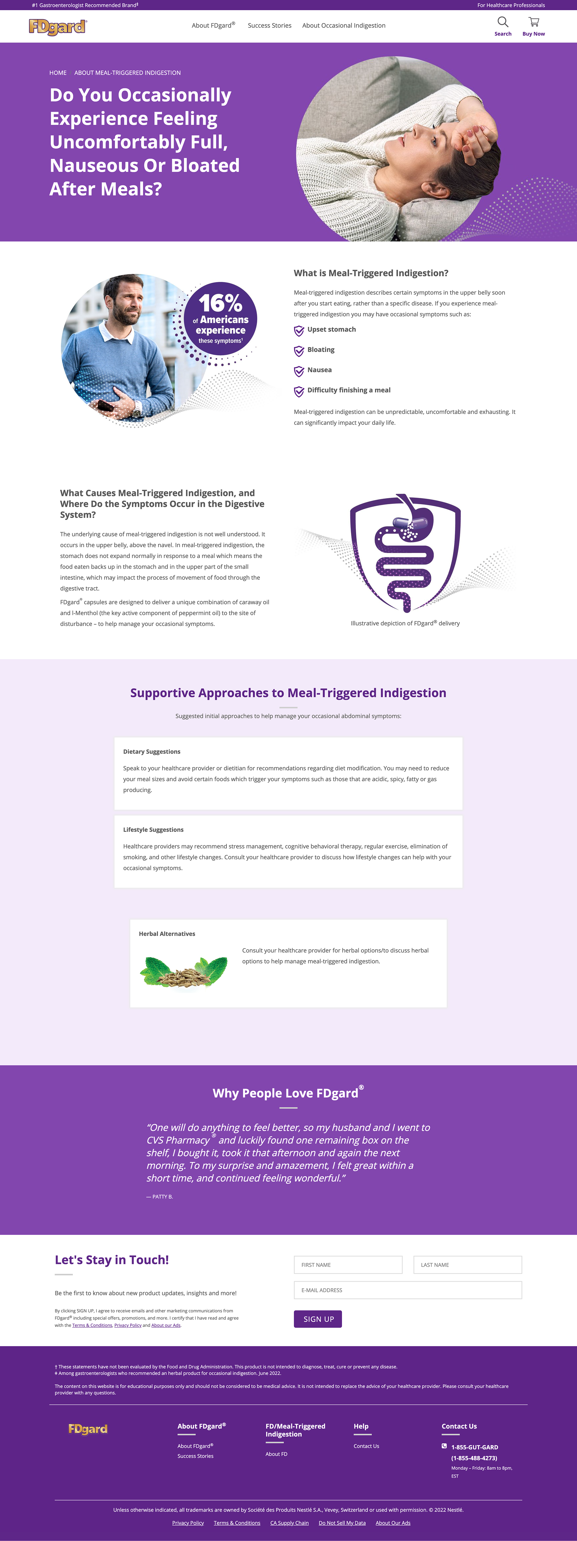
FDgard Educational Page
Breakfast Nutrition Page
Optifast Homepage
IBgard Educational Page
Nestlé Nutrition Store Homepage
✨ Takeaways + Next Steps
This project gave me a brand new vision of how successful landing pages are structured. Although it is just a landing page, the strategy behind the creation is much more complicated than I imagined. It combines UX and marketing from page layout to copywriting to visual hierarchy.
The next step is to A/B test different CTAs, copy, and graphics of the landing page.
🎥 Credits
Senior Digital Manager - Cassie Savage
BOOST Product Manager - Savannah Burkes
BOOST Brand Manager - Katharine Boyle
Designer - Kate Yip
Copywriter - Cassandra Rose